
Interpreting receiver waveform plots
Display
The vertical axis represents the amplitude of the received energy, shown as range bins.
The horizontal axis can represent time or other parameters according to which of the alternative plots is viewed. The initial offset period and the time span are editable.
The white graphline shows the received signal data.
The major ticks on the horizontal green lines have an intervals of 5Mhz, and the minor ticks an intervals of 1Mhz.
Example 1
The following figure shows an example of a receiver waveform plot. In this figure, the horizontal axis represents time. The data is acquired from a single transmitted pulse, and plotted both as raw IF samples and as the LOG of the detected power using the FIR filter for the current pulse width.
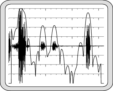
The IF samples are plotted on a linear scale as signed quantities, with 0 appearing at the center line of the scope. Any DC offset present in the A/D converter is not removed, and is seen as a shift in the baseline at higher zoom levels. For example, the converter's worst-case DC offset of 10 mv would appear as a several-hundred-count offset in the 16-bit A/D range. At the x32 or higher zoom scales, this offset would peg the sample plot off scale. Typically, the DC offset is much less than this worst case value, but RVP preserves the DC term in the Pr sample plot so that its presence is not forgotten.
The AC amplitude of the IF samples increases
when targets are present. On top of these samples, the detected power is drawn on a
logarithmic scale. Each horizontal line represents a 10 dB change in power. The graph is
scaled so that the LOG power reaches the top display line when the samples occupy the full
amplitude span. Using the previous figure as an example, the two equal-power targets just to
the left of center are approximately 18 dB down from the top. The amplitude of the samples
is 10(-18/20) = 0.13, that is, 13% of full scale. This
correspondence between the LOG scale and the amplitude scale applies regardless of the
plot's zoom level. As the IF samples are zoomed up and down by factors of two, the LOG plot
shifts up and down in 6 dB steps.
The LOG plot is obtained by convoluting the
FIR filter coefficients with the raw IF data samples, and then plotting log (I2
+ Q2) at each possible offset along the sampling interval. This
convolution produces only (1 + N- I) output points, where
N is the number of sample points and I is the length of
the FIR filter. For this reason the LOG plot begins approximately I/2 samples from left side
and ends approximately I/2 samples from the right.
The LOG points are computed at each possible offset within the raw IF samples. At the nominal 72 MHz sampling rate the spacing between LOG samples are a mere 4.17 m. The LOG plot gives a very detailed view of received power versus range. Of course, successive LOG points are highly correlated because successive input data intervals differ by only one sample point. This is why the LOG plots appear smooth compared to the instantaneous variation of the raw IF samples.
As the starting offset of the Pr plot is decreased to range 0, you begin to see part of the burst pulse (the second half of it) appear at the left edge of the plot. This is because the burst data samples are multiplexed onto the same fiber cable that carries the IF data samples. Zero range is defined to occur at the center of the burst window; the latter half of the burst pulse is visible when the plot begins at range 0.
Example 2
The following figure shows a Pr display with a frequency spectrum of the received data samples in a format that is nearly identical to the Ps display.
- The horizontal axis represents the same band of frequencies (half the sampling rate).
- The vertical axis represents power in 10 dB steps. The entire vertical axis is used so that an overall span of 80 dB is visible.
In this example, the time span is set to 50 μsec, with a 1 m antenna attached to the IF input so that a broad range of signals (radio stations, electrical noise, and so on) would be detected.
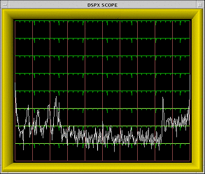
The purpose of the Pr power spectrum is to check for spurious interference in the IF signal from the radar receiver. View the spectrum with the transmitter turned off, and with the starting range moved out so that the burst samples are not mixed with the receiver data.
The power spectrum is computed using the complete interval of raw IF samples which, depending on the chosen time span, may contain many hundreds of points. The frequency resolution of the Pr spectrum can be quite fine to make it possible to discern any interfering frequencies with some detail.
The Pr spectrum plot shows a 0 Hz peak from any DC offset in the A/D converter, and is consistent with how the DC offset is presented in the Pr sample plot.
Both plots preserve the DC component of the IF samples so that it can be monitored as part of the routine maintenance of the receiver system. This is one of the few places in the RVP10 menus and processing algorithms where the DC term deliberately remains intact.