
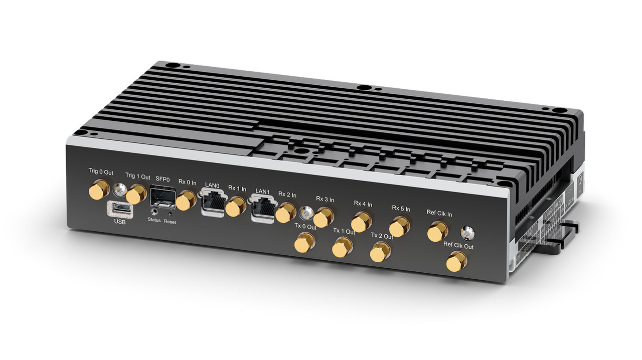
Burst spectra and AFC plot example
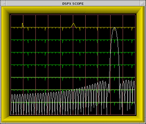
The following figures show examples of burst spectra plots. The display screen is divided into 2 areas:
- The top portion (yellow single line) shows the present AFC level. Ticks on the yellow line show the observed frequency and the frequency requested by the signal processor.
- The lower portion shows power spectrum plots of the burst pulse and/or the theoretical matched filter or passband filter response.
This figure is an example of a single filter response plot:
The following figure shows a combined display of the actual measured spectrum of burst signal and the digital filter curve computed by RVP. The combined display makes it easy to compare the filter being designed with the live waveform that it is intended to selectively pass.
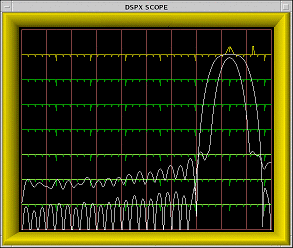
The filter's frequency response is always drawn with its passband peak touching the top of the plot. The vertical height of the burst spectrum varies with signal strength but can be adjusted using the Z subcommand.